
Color Theory: How Paint and Palette Shape Buyer Perception
Choosing color for the market, not just for yourself
September 2026 · 5 min read
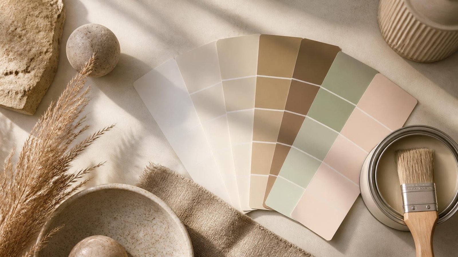
Few preparations do as much for a listing as well-chosen paint. Color can brighten a room, modernize a home, improve listing photos, and shape how buyers feel the moment they walk in. That feeling forms in seconds, and it often decides whether a showing becomes an offer.
Choosing color to enjoy and choosing color to sell are different tasks. For the market, a palette has to work with the home's light, fixed finishes, wood tones, stone, and architecture to create a first impression that feels welcoming and cohesive, without feeling like it belongs to someone else.
Design professionals are clear about the direction. In Fixr.com's 2025 survey of 67 home stagers and designers, 85% named soft or warm whites as the living-room colors that add the most value when selling.
Color Communicates Before Buyers Know Why
Color works on a subconscious level. It determines whether a room feels calm or energetic, warm or cold, current or dated, before a buyer has evaluated a single finish. Red is a good example: in some settings it reads as bold and luxurious, but overused or paired with competing finishes it feels overwhelming and personal. It says this is someone else's home, which is exactly the impression a seller needs to avoid.
On the color wheel, analogous colors (those next to each other) create harmony, and complementary colors create contrast. Both have their place, but for a home going to market the goal is almost always balance over distraction. And no paint color is seen in isolation: it lives alongside the rug, the trim, the flooring, the art, and the light at every hour.
2026 Color Families and What They Communicate
Trends change, so treat these as a guide to the current direction rather than rules. Today's most effective families share a common thread of warmth:
- Warm whites and antique creams: bright and welcoming without the chill of a stark white. The most dependable choice for main living areas.
- Khaki, sand, and greige: grounded and relaxed, and a natural match for the wood, stone, and woven textures common in coastal homes.
- Mushroom and taupe: a quietly refined alternative to cool grays that holds up across lighting conditions.
- Mocha and warm browns: comfortable and polished when balanced with lighter neutrals.
- Clay and terracotta: warmth and character, best anchored by softer neutrals.
- Restorative greens: calm and connected to nature, especially in bedrooms, primary baths, and offices.
- Smoky jade and teal: best on cabinetry or a single feature wall in rooms with plenty of natural light.
- Muted blush and creamy yellow: soft and optimistic when the undertone is carefully controlled.
Why Cool Gray Needs Careful Handling
The cool gray palettes of the 2010s arrived as a fresh response to the beige of earlier decades, then became so common that they began to read as dated and emotionally distant. Gray also has a technical challenge: it's especially prone to color cast, shifting toward purple, blue, or green depending on the light around it. When reviewing a home's existing palette, the question isn't only whether gray is dated, but whether this particular gray works in this particular light, and if not, which warm family should replace it.
Today's warm palettes aren't a return to the yellow-leaning beige of the 2000s. They're warmer and more layered, with the harsh undertones removed.
Color Changes With Light, Finish, and Surroundings
A paint chip is the least reliable way to judge a color. Warm wood floors reflect amber onto nearby walls. North-facing rooms get cool, indirect light that can turn warm beige gray; south-facing rooms get warm light that can intensify a color beyond its swatch. Even light bulbs change the result: the same paint reads differently under warm and cool white bulbs.
That's why testing colors in the actual room, at several times of day and under both natural and artificial light, is essential. A professional assessment reads each room's light sources, reflective surfaces, ceiling height, and relationship to adjoining rooms before recommending a color.
Color can also adjust how a space feels: high-contrast white trim adds definition against a deeper wall, and color-drenching a small room (walls, trim, and ceiling in one tone) can make it feel cocooning rather than cramped.
Paint Finishes
- Flat or matte: hides imperfections but is harder to clean. Best for ceilings and low-traffic areas.
- Eggshell or low-sheen: the practical standard for most listing-ready walls, soft in appearance and easy to wipe down.
- Semi-gloss or gloss: for trim, doors, and baseboards, adding durability and crisp definition.
The right finish tells buyers the home has been maintained, not hastily touched up.
Colors That Work Against a Listing
Bold, highly personal colors aren't bad design; they often reflect real creative expression. The problem is what they do to a buyer's attention. When a color demands notice for itself, buyers stop responding to the home and start thinking about repainting it.
In Fixr.com's 2025 survey, design and staging professionals named these the most off-putting interior colors for buyers: lime green (73%), bold pink (42%), red (35%), and purple (33%). Softening these before listing isn't about giving up design identity. It's about the difference between designing for yourself and designing for the market.
A Practical Framework: The Three-Color Principle
When preparing a home for market, limit the main paint palette to no more than three closely related colors throughout. A cohesive palette makes a home flow instead of fragment, and buyers experience a connected series of rooms as one intentional whole. This solves one of the most common presentation problems: homes decorated room by room, each with its own color story, that feel choppy when a buyer walks through them in sequence.
Warm-undertone palettes are especially effective in Wilmington-area homes because they harmonize with the materials buyers here are drawn to: natural wood, white trim, stone, and woven textures.
The right color doesn't just change how a home looks. It changes how buyers feel, and what they feel shapes what they decide.
Your Complimentary Staging and Color Assessment
Every listing consultation with Marissa Cartwright at Cartwright Realty, LLC includes a complimentary staging and color assessment tailored to your home's architecture, light, and fixed finishes. Contact Marissa at (910) 777-4759 to schedule yours.
Request a consultation or email Marissa directly
Sources
- Fixr.com, 2025 Interior Design and Color Trends Report (survey of 67 design and staging professionals): www.fixr.com/articles/interior-design-color-trends
- National Association of REALTORS®, "The Worst Home Colors for Selling in 2025": www.nar.realtor/news/styled-staged-sold/the-worst-home-colors-for-selling-in-2025
Equal Housing Opportunity. This article is general information, not legal, tax, lending, or insurance advice. Survey results reflect respondents' reported experiences; individual results vary by property and market.